Center for Motivation & Change
Full UX & UI Redesign
Overview
CMC came to us through our agency's established reputation working with behavioral health and rehabilitation facilities. As a high-end mental health and addiction treatment practice operating across outpatient, residential, and telehealth programs, they had a compelling clinical offering — but a website that wasn't doing it justice. Years of adding content page by page had left the site dense, disorganized, and difficult to navigate. For a practice where a user might be in crisis, or a family member desperately searching for answers, that friction carries real consequences.
The problem
The original site had grown organically rather than being designed with intention. Pages had been added over time without a cohesive information architecture to hold them together. The result was a navigation system that buried critical content — treatment options, how to get help, what to expect — under layers of menus and redundant pages. The visual design felt cluttered and dated, and didn't reflect the warmth, credibility, and elevated standard of care that CMC actually delivers.
The core issues were: too many pages with overlapping content, no clear path for a user who needed to find help quickly, visual density that created cognitive overload, and imagery that undersold the quality of the experience CMC provides.
My approach
Reducing the page count wasn't just a cleanup task — it was a UX decision. Fewer, clearer destinations mean fewer wrong turns at a moment when a user may already be overwhelmed.
On the visual side, I worked within CMC's existing brand while giving the layout room to breathe. Everything that had been cramped was opened up — more whitespace, cleaner type hierarchy, larger imagery. CMC invested in a full set of new photography for the Berkshires residential facility, and I made sure the design gave those images the space to do their job: communicating that this is a place of calm, quality, and genuine care.
The result
The redesigned site clearly communicates who CMC is and what they offer, with a navigation structure that guides users — whether they're seeking help for themselves, a family member, or a loved one — to the right information without friction. The elevated visual direction aligns with CMC's standing as a premium practice and the quality of clinicians and researchers behind it.
This project reinforced something I carry into every behavioral health engagement: the design decisions you make aren't just aesthetic. When the user is a person in crisis or a family that doesn't know where to turn, clarity and ease aren't nice-to-haves. They matter.
Before
Pages added over time with no central structure. Navigation mixed programs, conditions, and resources without clear separation. Users had to hunt to find how to get help.
Cramped layouts, content overload, dense text blocks, imagery that didn't reflect the quality of care or the Berkshires residential facility. Visual design felt dated and inconsistent.
After
Reorganized around user intent: Programs, How We Treat, What We Treat. Reduced total page count. Clear path from landing to getting help — critical for a user in crisis. Refined homepage content, showcase what’s most important.
Opened up whitespace throughout. New professional photography given room to lead. Typography hierarchy clarified. Design aligned with CMC's positioning as a premium, science-led practice.
⸻ Final Mock Ups ⸻
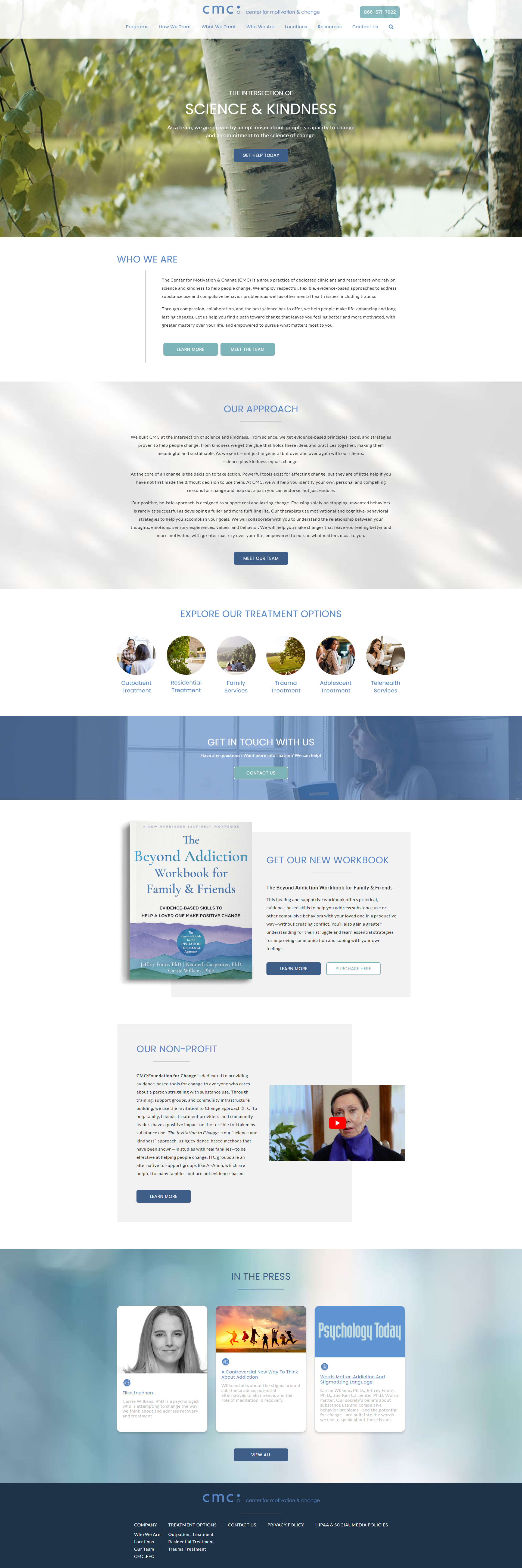
Home

About Your Stay
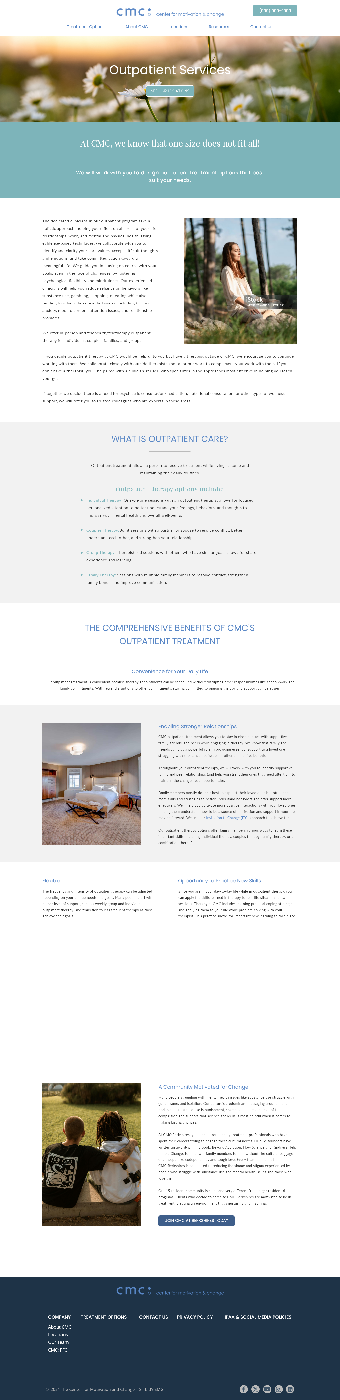
Outpatient Services

Residential Treatment (cropped)
Key Design Decisions
IA - Sitemap before screens
Restructured the full information architecture before any visual work began. This is especially important in behavioral health — the navigation is effectively the triage system for someone seeking help.
UX - Reduced page count intentionally
Fewer destinations means fewer chances for a distressed user to get lost. Content was consolidated, the goal was clarity — not minimalism.
Visual - Stayed within existing brand, opened the space
CMC's brand identity was retained — the redesign was an elevation. The primary visual intervention was whitespace: giving every element room to breathe and reducing cognitive load.
Visual - Built around new photography
CMC invested in new imagery for the Berkshires facility. The design was structured to showcase it — large, full-width placements that communicate warmth, quality, and environment at a glance.