Breathe Life Healing Centers
Website Refresh & Logo Design
Overview
Breathe Life Healing Centers has been a fixture in Los Angeles addiction treatment since 2013, founded by interventionist Brad Lamm — himself in recovery — with a Joint Commission Gold Seal of Approval and media appearances on Good Morning America, Oprah, and the Today Show. But when new ownership came in, the digital presence didn't reflect any of that credibility or warmth. The site was old, cluttered, and hard to navigate — and it failed to communicate something essential about who Breathe is and who they're here for.
I came in to redesign the site and create a new logo that could anchor the refreshed brand.
The problem
Breathe had accumulated years of content without a cohesive structure to hold it together. For a prospective client — or more likely a family member searching on their behalf — the old site made it difficult to understand what Breathe actually offered, what level of care was right for them, and whether this was a place that would genuinely understand and welcome them.
One of the new ownership's clearest priorities was ensuring the site communicated that Breathe is LGBTQIA+ affirming — being a genuine part of who they are and how they treat. At the same time, they didn't want to signal exclusivity. Breathe serves everyone. The messaging needed to hold both truths: we have a specific depth of expertise and commitment to the LGBTQIA+ community, and every person who walks through our doors is welcome.
Getting that balance right in both content structure and design tone was one of the central design challenges of the project.
My approach
I started with the logo. The new mark needed to feel warm, airy, trustworthy, and modern — reflective of a place where people come to heal. The result is the logo you see on the site today: clean, considered, and grounded in the brand's core identity without leaning on any single signifier.
For the site structure, I reorganized the content around how users actually arrive at a rehab center's website — typically in a state of urgency, searching for clarity. I separated Treatment Services, Levels of Care, and Signature Services into their own navigation categories so a user can immediately identify where they sit and what they need. LGBTQIA+ therapy services were elevated to the Signature Services section, giving them appropriate prominence without making the broader site feel exclusive to one community.
Throughout, I prioritized openness — visual breathing room, a tone that feels welcoming rather than clinical, and clear pathways to the most important action on the site: getting help. The admissions flow is accessible from multiple points, the phone number is persistent at the top, and the founder's story is given real estate on the homepage because personal connection matters in this space.
Credibility signals — the Joint Commission Gold Seal, DHCS licensing, insurance provider logos, accreditation badges — were organized and made visible, because families making this decision need reassurance at every turn.
The result
The refreshed site gives Breathe a digital presence that finally matches the quality and depth of care they deliver. The LGBTQIA+ positioning is handled with nuance — prominent without being limiting — which reflects how Breathe actually operates. The new logo carries that same balance, giving the brand a mark it can grow with.
This project reinforced how much UX in behavioral health comes down to language and hierarchy, not just layout. The words you use, the order you present information, and the visual signals you choose either build trust or erode it with a visitor who may already be frightened or uncertain. Every decision on this site was made with that person in mind.
Site Structure

Before
Years of added content with no clear architecture. Hard to understand what Breathe offered, who it was for, or how to take the next step. LGBTQIA+ services not clearly surfaced.
After
Reorganized into Treatment Services, Levels of Care, and Signature Services — matching how users actually think about finding treatment. LGBTQIA+ therapy elevated to Signature Services with appropriate prominence.
Core challenge
The LGBTQIA+ balance problem
The key design challenge: make LGBTQIA+ affirmation genuinely visible and prominent — not buried — while ensuring all visitors feel welcome. This required deliberate decisions in both navigation structure and visual tone.
⸻ Final Mock Ups ⸻

Home

Intensive Outpatient Program
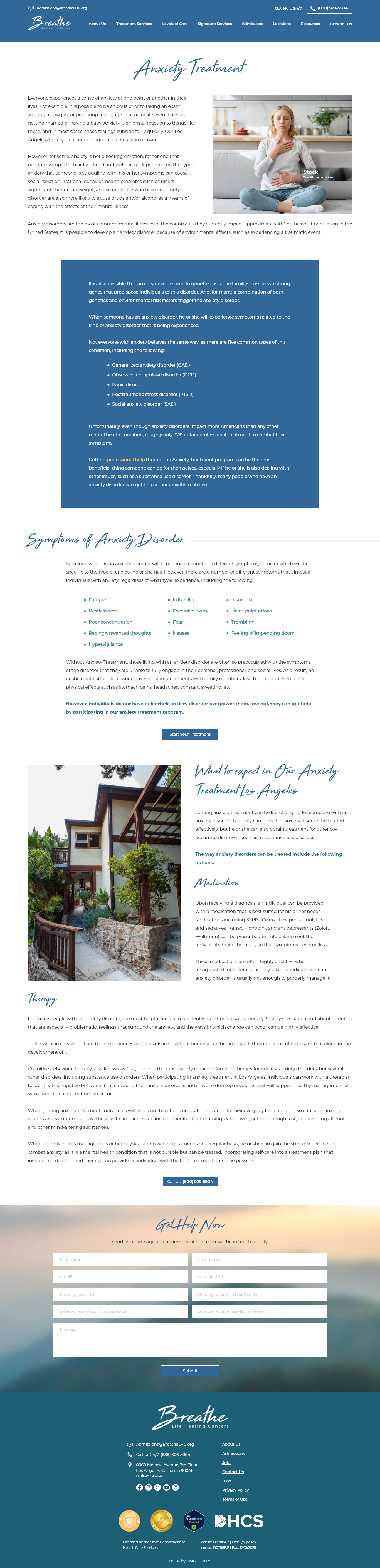
Anxiety Treatment
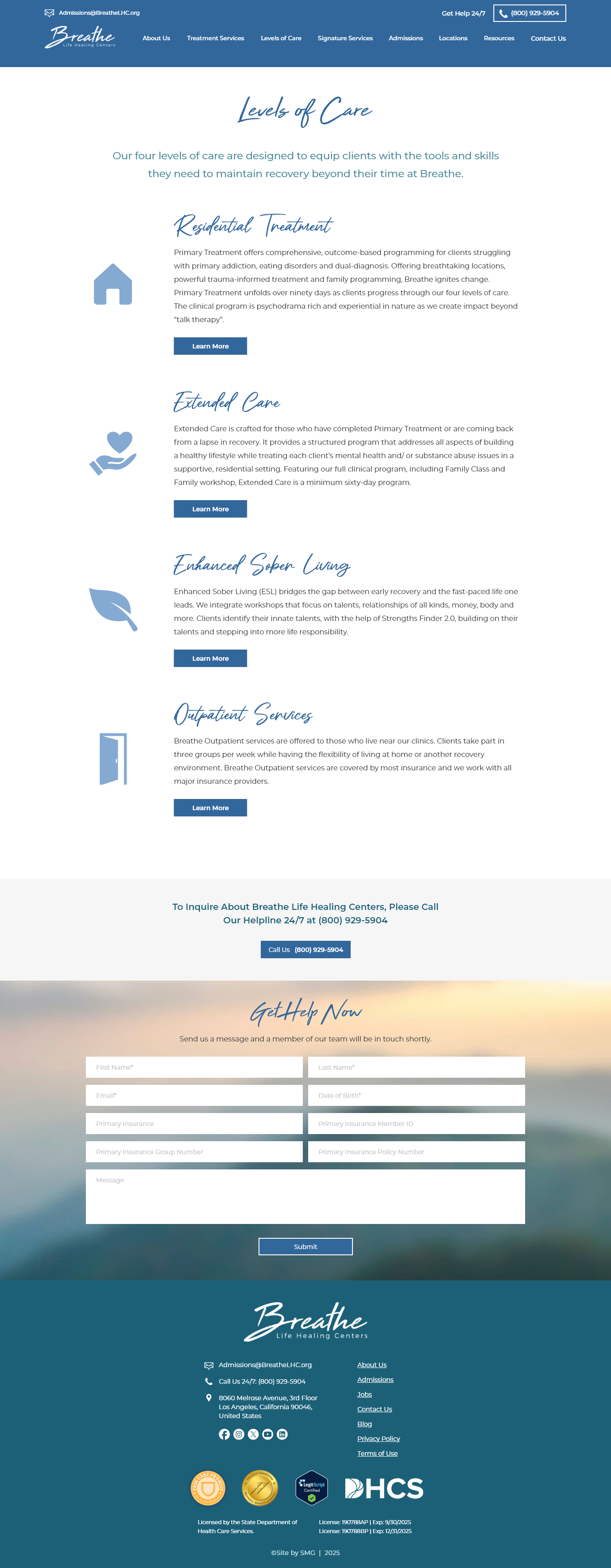
Levels of Care
Key Design Decisions
Brand - New logo designed from scratch
Created a new logo to anchor the brand refresh. The mark needed to feel warm, airy and trustworthy for a broad audience. Clean, grounded, and built to grow with the brand.
Strategy - LGBTQIA+ affirming without exclusive
LGBTQIA+ services were given real estate in the navigation under Signature Services — prominent enough to signal genuine expertise and commitment, structured in a way that doesn't imply the broader site isn't for everyone.
UX - Designed for a visitor in crisis
The phone number is persistent in the header. Admissions CTAs appear at multiple points. The founder's personal recovery story leads on the homepage — because human connection matters when someone is deciding whether to reach out. Every friction point that could delay a call for help was reduced.
Credibility - Surfaced trust signals throughout
Joint Commission Gold Seal, DHCS licensing, insurance provider logos, and press appearances (GMA, Oprah, Today Show) were organized and made visible — because families making this decision need reassurance at every scroll depth.
UX - Opened up the visual tone
The redesign moved away from dense, clinical presentation toward breathing room and warmth. In behavioral health, visual tone communicates safety. A site that feels calm and open signals that the environment will be too.